I can't wait to share the upcoming shows we have planned for our gallery in the next few months.
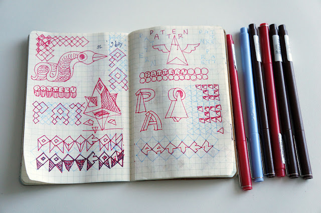
As I finalize the details I wanted to show the process I used to create the type for the first show,
Illustrative Patterns.
For the word, pattern, I wanted to use a consistent triangle shape for each letter and keep the designs as
uncomplicated as possible - and readable of course. This was a big challenge for the letter T inparticular. I also used the same weight and length for the lines and inverted the colours letter by letter.
For the word, illustrative, I loosened up the rules but the letter L was pretty tough.
When I move the design over to the computer I like to work in black and white until I have it working.


